Small blog changes
I had some time today so I thought about small changes on the blog. Something small. I noted the blog entries are increasing, and the space used for one blog entry can be shorten. The current view is the following:
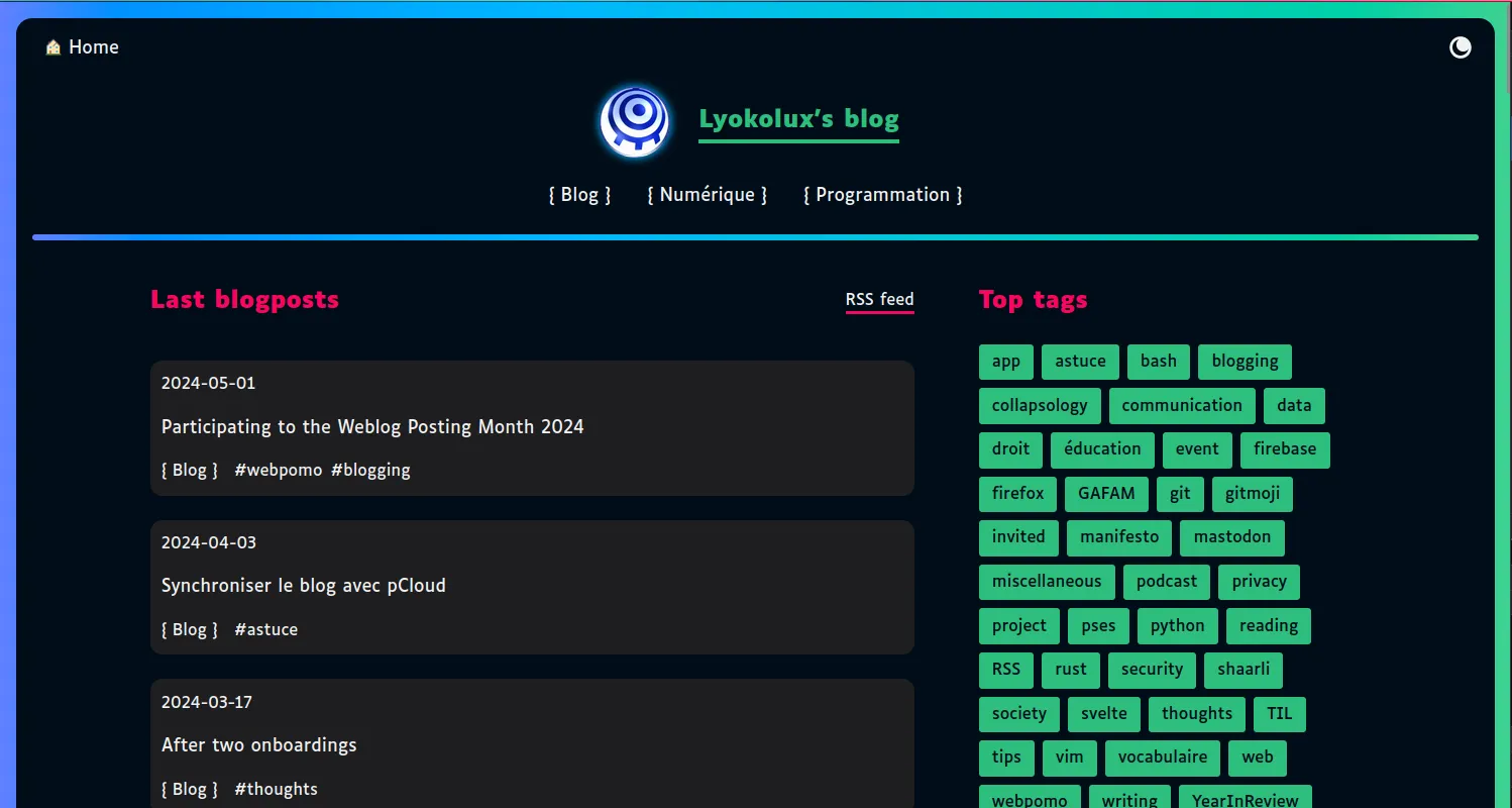
I still want to provide information about the category and tags to sort the blog entries by interest. Okay. How can the layout be reduced?
The date is moved next the heading in order to spare one line. This change reduced a blog entry on 2 lines. Setting the blog entry padding to 1rem instead of 0.7 make it consistent.
The gap between the category and the tags is reduced to 0.5rem in order to group them visually.
The first blog post header is also closer to the heading of the page “Last blogposts”.
I also ensured it is readable on small screens: the date wraps on a new second line when the title is too long. The gaps are already set. Neat.
The following screenshot shows the result:
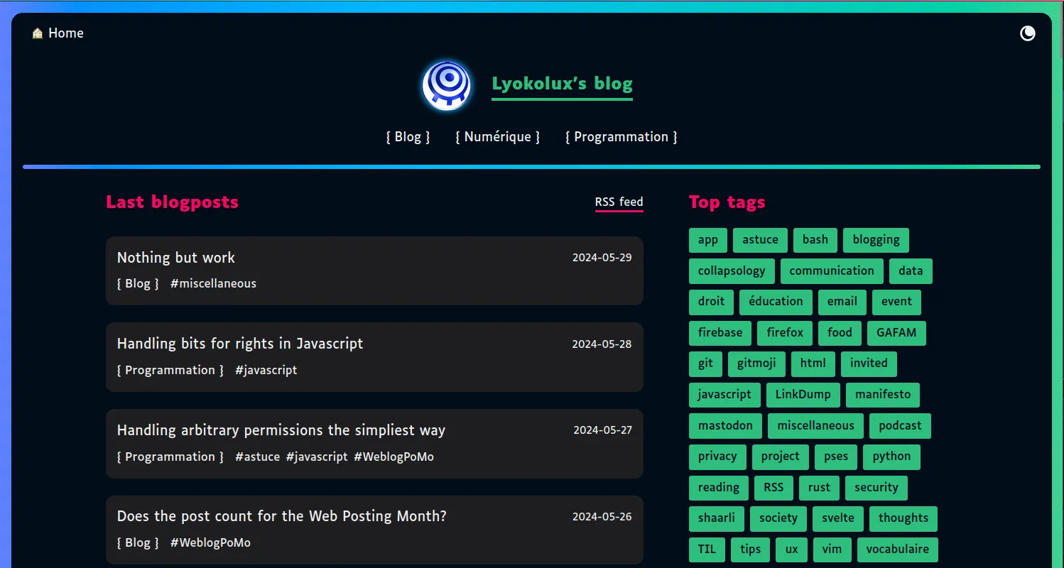
The color of the blog entries does not match my current expectations though. The background color of the monokai theme does not fit well on my theme. That’s for another change.
It is satisfying to tinker with CSS and get results after a short amount of time. If you have any ideas for improvments, feel free to reach me out!